


You’ve found your niche, and now it’s time to build a high-converting sales page for your upcoming launch.
Whether you’re deciding how to launch your product for the first time ever or you’ve launched before, how do you know if your sales pages are working as well as they could be?
If you think a high-converting sales page is just a guessing game, I’ve got some news for you, friend. It’s not. When it comes to the perfect sales page, there are years of research and so much data gathering involved that it could make your head spin. Lucky for you, you don’t have to learn the hard (and slow, and expensive) way because it’s all been done for you.
Today I’m sharing Jenna Kutcher’s (👋) guide on how to build your next sales page in a matter of hours with Showit!
Why shopping at Target is just like crafting a sales page
(Yes, really!)
So, let’s take this to Target, because who doesn’t love an afternoon escape to Target? Also, both Marisa (my integrator) and I worked for Target corporate, so this is a fun case study.
Picture this: We walk into Target for something we need (often a necessity, like toilet paper), when suddenly we are made aware of everything else we need by all the signs, the way the store is laid out, and the fun shopping experience that the brand creates.
Before we fill up our cart with that pair of on-trend heels, all-natural shampoo, or high-waisted wide-leg jeans… we think, “Where will I wear these heels? Will this work for my hair type? Will these jeans make my butt look damn good?”
This, my friend, is the consideration phase. We try the heels on. We read the label on the shampoo. We model in the fitting room. What we’re doing is considering whether or not these things are right for us.
And just to be clear: there is no want vs. need. If we want it, we will convince ourselves of the need. So, alas, we add it to our carts, head to the checkout, and get a rush of excitement when we make the purchase (read: sale phase). We walk out feeling great about our new purchases because we got what we wanted and the experience was enjoyable!
At this point you may be like, “Okay, Jenna, we get it. Target is great, but what does this have to do with my sales page?” The answer is: everything.
Let’s look at the words I chose to put in italics. Awareness → Consideration → Sale. Write those three little words down (and in that order), because that is your sales page journey.
The same sales process that occurs at Target, occurs for your digital products. But how do you create that strolling the Target aisles bliss when there’s no physical store to get lost in? You guessed it: your sales page is the aisle… so let’s get them strolling scrolling.
The KEY to a high-converting sales page
You guys, I’m not kidding—when I first started adding sales pages to my site I would either A) spend HOURS writing copy, fussing over the design, testing everything (only to find out the design I was finally happy with looked great on desktop but was completely unusable on my phone). It was a nightmare.
Or B) hunt down a website designer and copywriter, and fork over so much more than I should have (and I would inevitably end up making changes to it myself anyway). Sigh.
Let’s just say I learned the hard way so that I could really appreciate the easy way. Thankfully, Showit entered my life and completely changed the way I think about sales pages.
To build your next sales page in a matter of hours with Showit, I am going to let you in on how me and my team tackle these pages each and every time we have a new course or digital product to drop. The answer is: a TONIC sales page in the Showit platform.
If you’re like “Jenna. A template??” I get you. Let me clear the air about TONIC templates. You guys, these things are legit. If you hear the word template and immediately think there is no way you could have a great website that actually feels unique from a template, then I’m happy to invite you to check out TONIC.
Jen Olmstead (one half of the founder and design team at TONIC) is my personal bff and designer, which means I trust her to deliver nothing but the best for you all!
RELATED: Why You Can’t Sleep on These Easy Showit Website Templates
How to Build a High-Converting Sales Page in Just Hours
So, let’s talk about how with Showit, you can get your sales page drafted, designed, and up + running in a matter of hours. Here’s how!
Step 1: AWARENESS
Let’s set the scene using the Target example from above. Someone stumbles onto your site looking for something they need, something essential to their business. (Whatever toilet paper is to them, ya know?)
They need something from you—and they need to be made aware that you’re the only one that can do that specific thing for them.
As they browse, it should be loud and clear how you can help them solve that problem. This really comes down to value-focused copy. While you may be like, “But, Jenna, words are not my thing.” Or, maybe they ARE until you try to sell something. I get it.
If “Buy my stuff!” is about the only thing you can think of when writing sales copy, I’ve got good news. Are ya ready for it?
TONIC sales pages (the ones I legitimately recommend to ALL of my friends) come with built in copy prompts. What does that mean? It means that all you have to do is take their prompts, make the copy match your offering, and you’re good as gold! Talk about saving hours and hours of work. They take care of all the hard stuff, give you prompts, and you just put the finishing touches on it. Bless up for that. 😉
Let’s look at a real life example. The TONIC Paper Plane sales page has the prompt, “Here you are going to state the challenges and frustrations that they might currently be facing.” This copy is there for a reason!
TONIC knows that at this exact spot on your sales page, your readers are thinking, “Okay, I know what you offer, but is this product/service the right fit for ME?” So, when you reach this point on your sales page, you know exactly what kind of copy needs to go there because TONIC laid it out for you!
Example below ↓
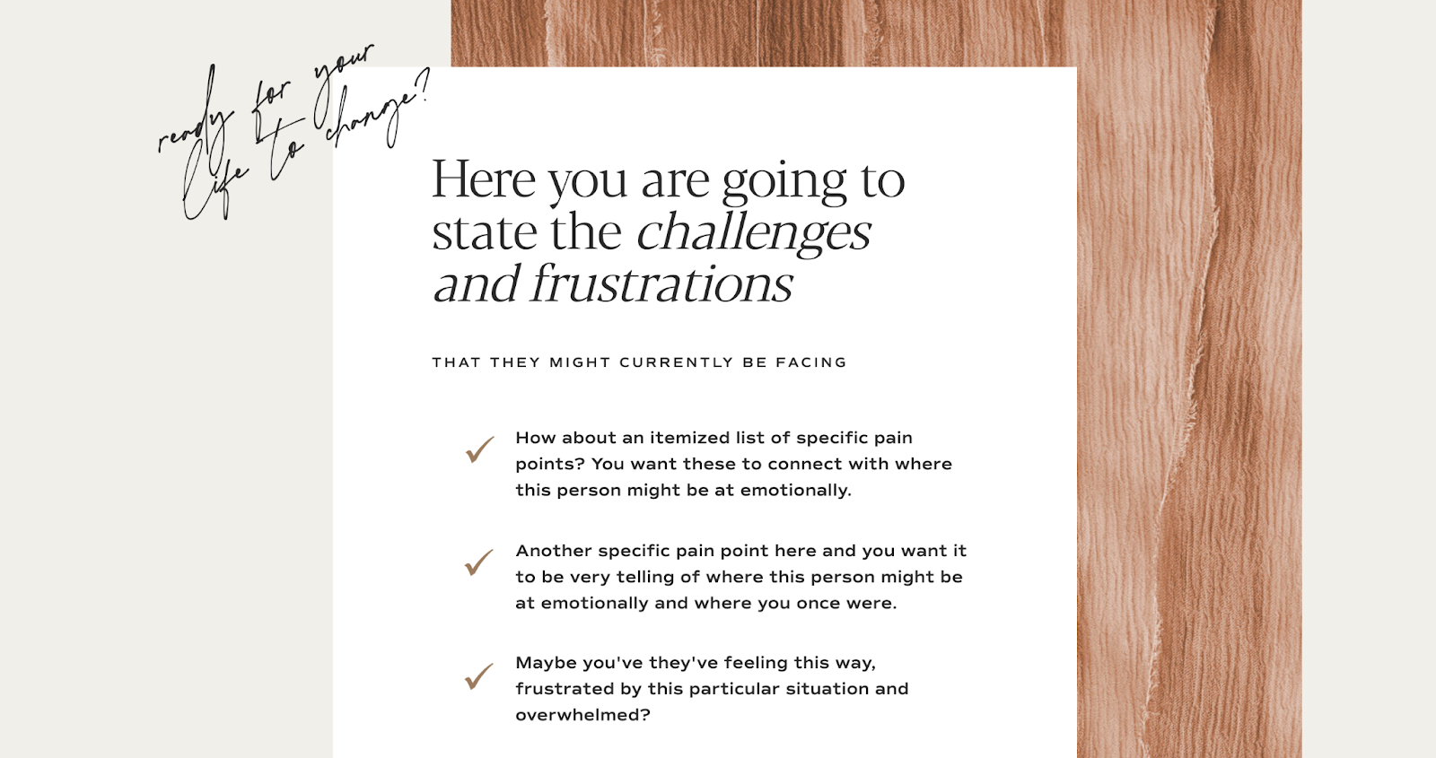
Not only do these sales page templates look absolutely amazing, the copy prompts tell you exactly what to write and where to put it.
Clear copy is your awareness—it brings to light their problem and your solution. TONIC sales pages have copy prompts so you know exactly what copy should go where for the highest conversion rate. Got it?
Step 2: CONSIDERATION
Next, for consideration we need to answer things like: why will this work? Why should they trust that you’ll deliver? How can they believe that your jeans will make their butt look really freaking good when they can’t try the high-waisted wide-leg jeans on?
The answer: Social proof. Louder for the people in the back—SOCIAL PROOF.
The quickest way to convince someone that they will find that thing in your digital product are testimonials from people that are just like them. Real people with real results that really changed their business forever.
We live in a world driven by influence—allow your previous clients to influence new clients on your behalf. It’s important that your website has answers for every question, roadblock, and reservation that pops into the mind of your readers. Let your past clients do the talking for you.
The TONIC sales page templates and Showit platform make infusing your social proof extremely easy. Because the pages already have social proof canvases infused throughout the design, all you do is simply replace the placeholders. It’s literally as simple as double-clicking the placeholder content and pasting in your own content. That’s it.
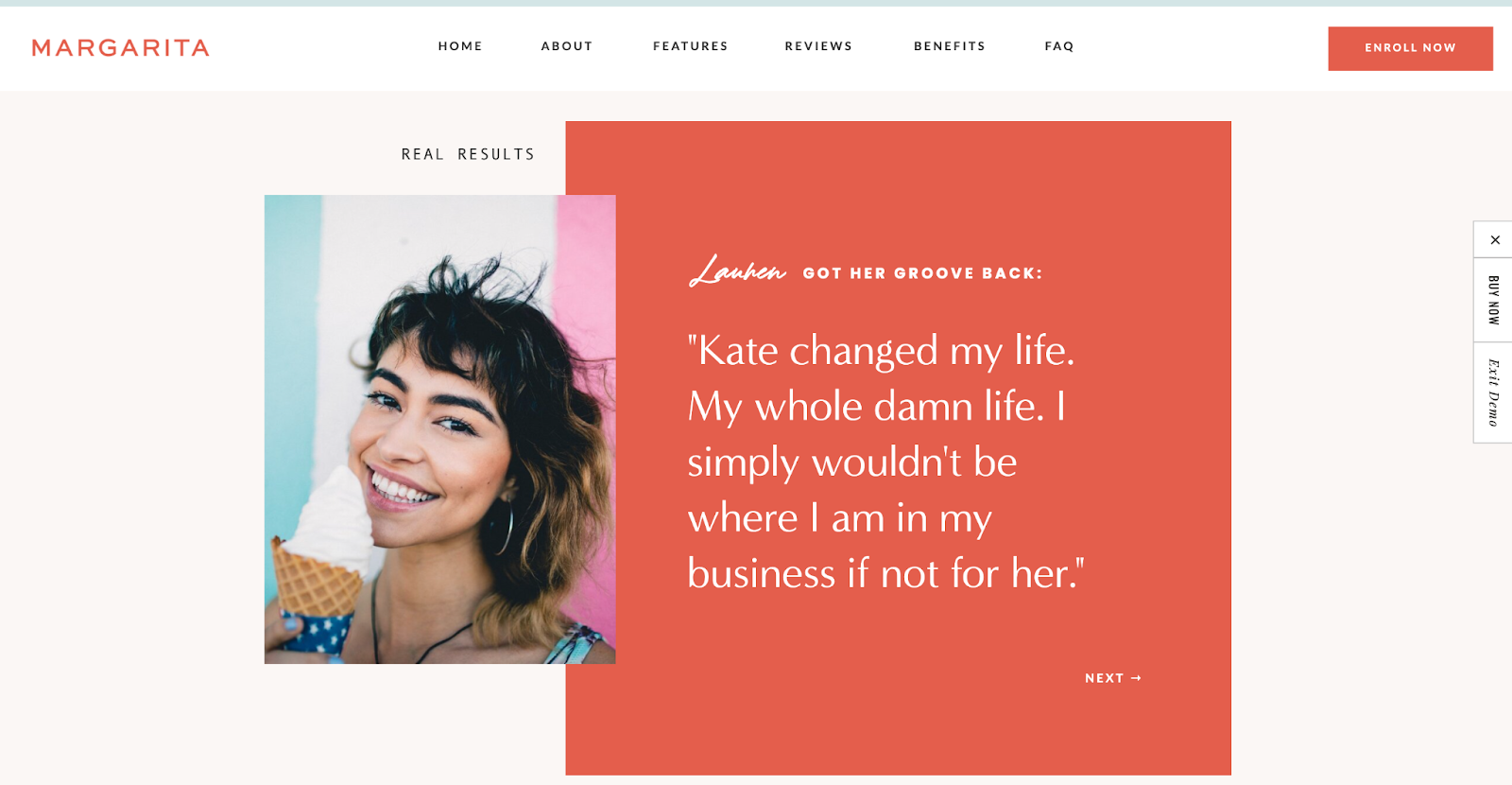
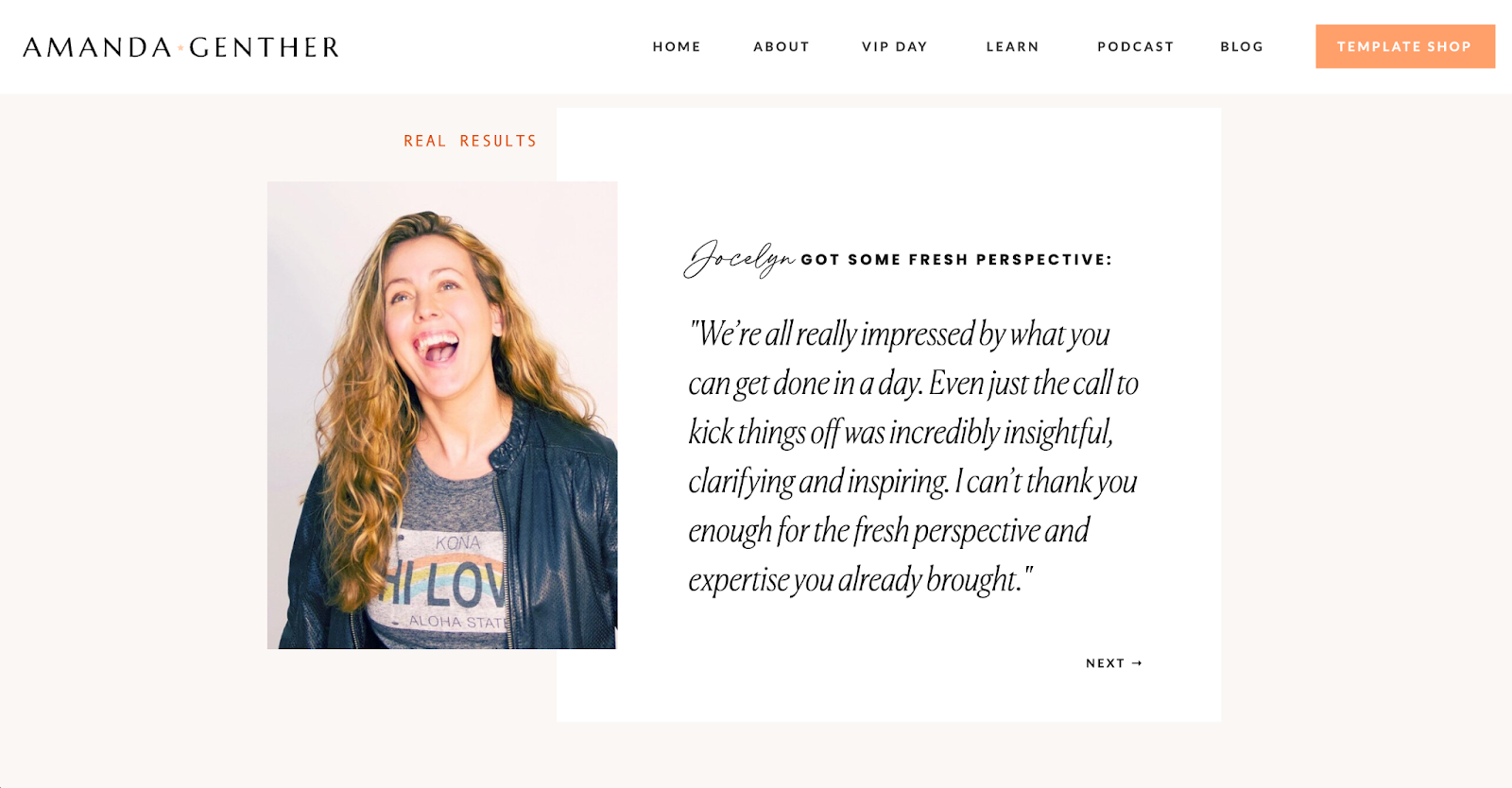
A real life example of a TONIC customer using social proof below ↓
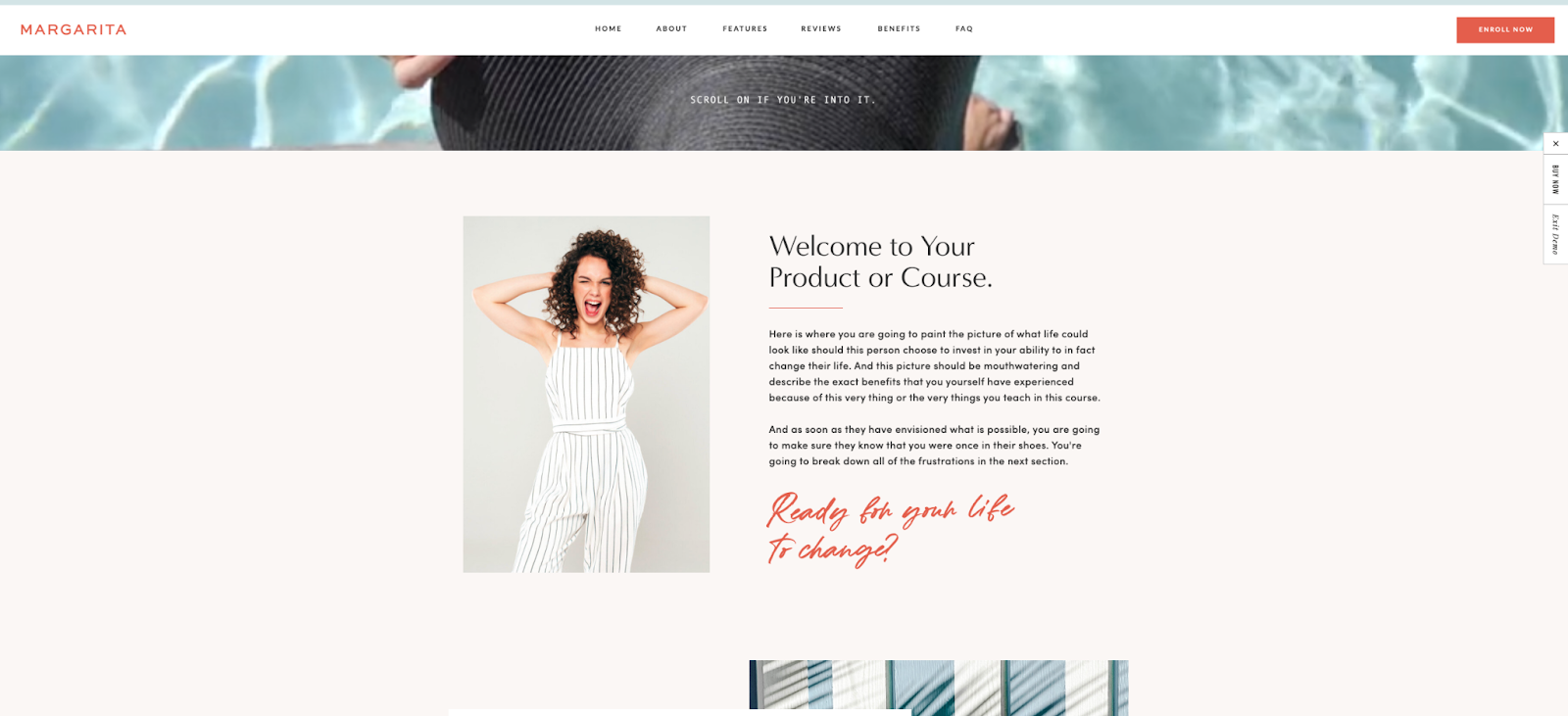
The TONIC Margarita Sales Page template before:
The TONIC Margarita Sales Page template after :
Step 3: SALE
Something that digital stores have over brick and mortar stores are that digital stores enable quicker purchasing decisions. What exactly do I mean?
Think back to the last time you needed help at a store (that wasn’t Target) but couldn’t get it. Whether you needed someone to reach a product from a high shelf, check in the back for an item that the website swears is in stock (*sigh* it never is, is it?), or simply retrieve your in-store pickup. Whatever the scenario, you needed assistance but it wasn’t easy to get it.
This is what your customers feel like when navigating a less-than-stellar sales page. If your viewers feel like they need assistance to take the actions they want to take on your sales page, well, it’s time for a new sales page. The goal of a great user experience on your site is to make the user feel like everything they need is exactly where they need it, when they need it (without ever having to think about it).
Accomplished through strategically placed CTA (call to action) buttons, you can beam me up, Scottie, and give your clients the product now and with minimal roadblocks. With thoughtful UX (user-experience) infused in the TONIC sales page designs, Jen and Jeff strategically placed CTA buttons in high points of interest.
Aka: These websites are designed to make check out easy. Which means you’re in the right place at the right time to close a sale. All you have to do is link out your sales page CTA button to your payment processor for that specific product and you’re up and running, friend.
“Show me an example!” you say? I thought you’d never ask! 😉
TONIC’s Margarita Sales Page template:
TONIC’s conversion optimized CTA’s in action!
Pro tip: Just getting started and don’t have a course platform yet? I’ve got you! There are tons of purpose-built platforms to actually process payments and deliver the products safe and sound to your client. For this we recommend: Kajabi, Teachable, or Thinkific. Once you get that set up, all you have to do is link your magic CTA buttons on your TONIC sales page to your course / product / etc. and—*poof!* You’re ready to make sales. Easy peasy.
What you put on your sales page MATTERS
When it comes down to it, the way you display your product or service is absolutely vital to converting visitors into customers. The goal is to take your viewers on a self-guided journey of discovery, answer all their questions and concerns, and make it clear why they should take action now (and how to do it).
A good, high-converting sales page makes your viewers aware of what problem they have and how you are going to solve it, removes roadblocks that they might have while considering your solution, and makes it really freaking easy to buy from you. The right layout and design is critical in making this happen! Thankfully, all that hard stuff has been done for you!
Let’s recap: Here’s how to build your next sales page in a matter of hours with Showit!
- Snag your TONIC Sales page to be used via the Showit platform.
- Insert your conversion-focused copy using TONIC’s built-in copy prompts.
- Source + add your social proof / testimonials to the page.
- Link out to your course / digital-focused platform from the CTA buttons to seal the deal.
Ready to build your sales page? I thought so. When you’re done, then tag me in your next product launch so I can cheer you on while the sales roll in.
Ready to get your new sales page up ‘n’ running?
Tonic is offering my friends (that’s you!) a mega-discount on their templates!
")


 (1)")


")


")


