


If your website isn’t helping you stand out, attract your dream clients, and get results, you might be making one (or more) of these common website mistakes. The good news? They’re totally fixable! I’m teaming up with my go-to web designer, Jen Olmstead of Tonic Site Shop, to walk you through the top six mistakes we see all the time, plus simple tweaks to help you fix them today.
Want walk away from this article with an easy action step you can take to make your website better in just a few minutes? Download The 5-Minute Website Conversion Audit guide for free and learn how to start converting your traffic into clients and customers with just a few shifts!
Why a Strong Website Actually Matters
Let me take you back to when I first started out. I didn’t have a fancy website… or even a website at all. I had a blog. No contact form. No brand identity. Just a place to share my thoughts and work.
Eventually, I realized my site was “blending in” more than it was standing out. I wasn’t excited to send people to it, and honestly, it didn’t feel like me. That’s when I knew: I needed more than just a site that functioned. I needed one that created connection.
That’s what this post is all about. If you’re ready to stop settling for a site that just exists and instead create a website that works, read on for the six most common website mistakes (and how to fix them fast).
Common Website Mistake #1: You’re Not Creating Connection
It’s so easy to hide behind your work without even realizing you’re doing it. You’re proud of your services or your products (and rightly so), but if your website doesn’t show your face or tell your story, it’s missing a huge opportunity to connect. If it’s packed with generic language, it’s time to rework it so people can actually get to know you.
Your audience isn’t just looking for a professional; they’re looking for someone they connect with. That starts with a warm photo where you’re actually smiling at the camera, and copy that sounds like you wrote it, not like a stranger’s LinkedIn profile.
You don’t have to overshare or write a memoir here. Just ask yourself: would my best friend recognize me in this copy? If not, let’s update it so your dream clients get a little taste of who you really are.
- How to Fix it: Add a warm, approachable headshot where you’re looking directly at the camera. Write your “About Me” page like you’re talking to a new friend over coffee, not pitching a product. Let people hear your voice in your words.
- Pro tip: Did you know that your “About” page is likely the second-most visited page on your site? So, make it personal, inviting, and reflective of who you really are.
Common Website Mistake #2: Your Brand Message Is Unclear
If someone lands on your website, how quickly can they tell what you do and who it’s for? If you’ve got too many buzzwords or you’re speaking in vague “we help businesses thrive!” language, it’s probably not landing.
One of the most common website mistakes I see is people burying the lead. You know what you do, but it’s not showing up clearly on your homepage or your headers. We want that message front and center. Imagine someone clicking your link from Instagram and only giving you 10 seconds to decide if they’ve found their person… would they know exactly what you do and how you can help them?
This doesn’t mean writing out your full life story or every offer you’ve ever created. It just means dialing into that core message (i.e., the transformation you offer) and letting it guide the rest of your site. So take a step back, simplify the language, and speak directly to the one person you most want to serve.
- How to Fix it: Lead with what you solve. Keep it simple. Ask yourself, “Would my dream client read this and say, ‘Yes, this is for me!’?” If not, rewrite until the answer is yes.
- Bonus: Don’t try to appeal to everyone. The right message should attract the right people and gently filter out the rest.
RELATED: Simple SEO Practices to Boost Your Website Traffic
Common Website Mistake #3: Your Offerings Are Confusing or Overwhelming
You know that feeling when you walk into a restaurant and the menu is eight pages long and you’re like… wait, what am I even hungry for anymore? That’s what your website can feel like when your offers aren’t clearly laid out. And this is such a common website mistake because most of us are multi-passionate, and we want to show everything we can do.
But here’s the truth: when you try to speak to everyone, you end up speaking to no one. And when you offer everything, people don’t know where to start.
So here’s your gentle nudge: simplify it. Pick your best, most aligned offers. Use specific, clear language to explain what they are, who they’re for, and what action someone should take next. Make it easy to say “yes!” without having to click 12 times to figure it out.
You can still be multi-passionate, just organize it in a way that guides your dream client where you want them to go.
- How to Fix it: Simplify. Highlight your best work and clearest offers. Make sure your pricing, process, and next steps are easy to find and understand.
- Need an example? When I revamped my photography site, I only showcased three weddings out of hundreds. Why? Because they represented the kind of work I wanted to book more of. Less is more, friend.
Common Website Mistake #4: You Look Like Everyone Else
Let’s talk about the dreaded sea of sameness. If you’re using a trendy template with trendy colors and trendy copy, your website might look good… but if it could just as easily belong to five other people in your industry, then it’s not helping you stand out.
This is one of those sneaky, common website mistakes because we often create our sites with one eye on what our peers are doing. But your website isn’t for them. It’s for your clients. Your dream clients want to see what makes you different. That starts with leaning into your story, your quirks, your values, and your voice.
You don’t have to reinvent the internet or be flashy to be memorable. You just have to be yourself. Let’s stop people-pleasing your peers and start creating a space that’s unmistakably yours. That’s how you stand out, and that’s what turns clicks into clients.
- How to Fix it: Bring in unexpected inspiration. Think outside your industry. Focus on telling your unique story and designing a site that feels like a reflection of your brand, not your competitors’.
- Pro Tip: Don’t create for your peers. Your website is for your clients. Speak their language. I know this can feel counterintuitive because “I need to stand out amongst my competition!” And you will when you design and write your site with your clients in mind, trust me.
RELATED: Are TONIC Site Shop Website and Social Media Templates Really Worth the Price?
Common Website Mistake #5: It’s Hard to Contact You
We’ve all seen those websites where you have to hunt around like you’re playing hide-and-seek just to find a contact form. Or worse, you finally find it, and it’s 20 questions long like a job interview. No, thanks.
Remember this: if someone is trying to reach out to you, they’re already interested. Don’t make it hard for them. One of the most common website mistakes is complicating the contact process or only giving one way to reach you.
Instead, make your contact page super simple. A few fields (think: name, email, quick message) are all you need to start the conversation. And while we’re at it, include that form on multiple pages, not just one little button tucked in the footer. Your dream clients shouldn’t have to work that hard to hire you!
Map out the journey from “never heard of you” to “ready to book” and make sure your contact points are clear, easy, and accessible.
- How to Fix it: Keep your contact page easy to find and simple to fill out. Include it in your main menu and sprinkle calls to action throughout your site. Ask only for what you actually need to start a conversation.
- Real talk: If your contact form feels like a job application, people won’t fill it out. Make it easy!
Common Website Mistake #6: You’re Hiding Your Email Opt-In
Your email list is where the magic happens—it’s the place you nurture relationships, build trust, and turn casual visitors into paying clients or customers. But one of the biggest common website mistakes? Hiding your opt-in at the very bottom of one lonely page.
Here’s my advice: treat your opt-in like your favorite freebie. Give it a spotlight. Feature it near the top of your homepage. Mention it in your blog posts. Embed it in your about page or service page. People won’t join your list if they don’t know it exists (or if they have to scroll forever to find it).
You’ve worked hard to create something valuable—whether it’s a free guide, checklist, mini-course, or even a discount code. Don’t be shy about inviting people to grab it. The easier it is to find, the more people you’ll be able to connect with after they leave your site. And that’s where conversions happen.
- How to Fix it: Feature your freebie or opt-in near the top of your homepage, in your blog sidebar, and within your about page. Make it easy for people to say yes.
- Need help with this? I’ve got a whole free training on building your email list in an easy, no-tech-skills-needed, starting-totally-at-ZERO way!
The “Mom Test”: A Simple Way to Improve Your Website’s Clarity
If you’re feeling unsure whether your website is actually working the way you want it to… try the Mom Test.
Here’s how it works: grab your mom, your partner, your bestie, or literally anyone who doesn’t live in your online world. Sit them down with your website open, and ask them to walk through it, without giving them any instructions. Just let them click around, poke through the pages, and try to figure out what you do, who you help, and how to contact you. Your job? Sit back, observe, and take notes.
Why do I call it the Mom Test? Because if my mom can find her way through my site, figure out what I offer, understand who it’s for, and know what she’d do next, then I know I’ve done my job. And trust me, my mom’s not exactly keeping up with the latest UX trends. (Sorry, Mom. Love you.)
This test works because it takes you out of the equation. You already know where everything is on your site. You know what you mean when you say “elevated strategy sessions” or “signature process.” But someone brand new? They don’t. And if they’re confused, they’re clicking away.
So, what are you looking for when they navigate?
-
Do they know what you offer in the first few seconds?
-
Can they figure out who your work is for?
-
Do they know what step to take if they want to hire you or learn more
-
Do they feel invited into the experience, or left out by jargon or overwhelm?
After they’ve explored, ask them what stood out and what wasn’t clear. You might feel nervous hearing their feedback, but it’s some of the most helpful insight you’ll ever get. Don’t be discouraged by what’s not working. Let it guide your tweaks!
Ready to Fix These Common Website Mistakes?

If your website isn’t passing the Mom Test or one (okay, all?) of these common website mistakes rang true for you, take a deep breath. You’re not behind. You’re not failing. You’re just ready for the next level. And the best part? Most of these changes are simple, powerful tweaks that can completely shift how people experience your brand.
Here’s your quick-fix checklist to run through today:
- Show your face: Add a clear, smiling photo of you where visitors can see the human behind the brand.
- Make your “About” page personal: Let people connect with your story, not just your skills.
- Clarify your message: In the first few seconds, can someone tell what you do, who it’s for, and how to work with you?
- Simplify your offerings: Highlight your strongest offers and guide people toward the next step.
- Stand out: Infuse your personality—stop trying to look like everyone else. Your uniqueness is your magic.
- Make contacting you easy: Trim your form fields and place that “Contact” link in multiple spots.
- Move your opt-in above the fold: Don’t bury your freebie! Make it impossible to miss.
- Run the Mom Test: Watch someone click through your site and take notes on what’s working and what’s not.
You don’t have to overhaul everything overnight. Start small. Edit one section. Then another. It adds up faster than you think.
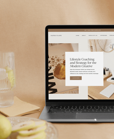
And if you’re ready for a website that’s not just pretty but powerful and something you’re proud to send people to, grab one of the same gorgeous TONIC templates I trust and love. Use code JENNASENTME to save 10% and get a head start with a design that’s already built to convert.
Because every tweak you make is helping your message shine a little brighter. And that? That’s worth showing up for.
Want Help Making Your Website Gorgeous AND High-Converting?
Snag a stunning template from my own personal web designer + get 10% off!
")


 (1)")


")


")


Well, I’m only making 1 or 2 of these mistakes at least! I see so many websites that it’s impossible to contact, or there’s no clear CTA or next step… what I’m working on improving is a great about page that creates that connection you’re talking about! Do you have any other posts or guides to walk you through creating an about page? I find it really tough to write about myself!